Alright, so you’re locked in a staring contest with your website, watching it inch along like a snail in a snowstorm. And yeah, you’re probably muttering the exact same thing I was six months ago: ‘What the heck is taking so long?’
Here’s the brutal truth—the one I desperately needed to hear sooner: it’s almost certainly your images. I get it, trust me. You poured hours into finding those perfect shots, and now I’m the bearer of bad news. But seriously, hear me out.
The Format Dilemma (Or: Why I Spent Three Hours Googling “JPEG vs PNG”)
When I first dipped my toes into image optimization, I was utterly clueless about formats. My strategy? Just blindly upload whatever my camera spat out. Colossal screw-up.
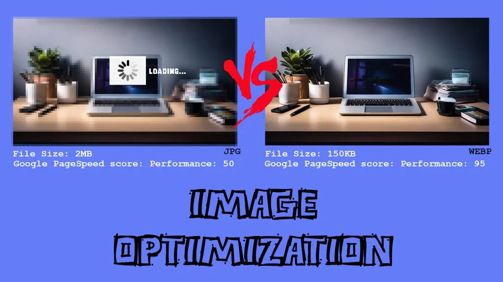
JPEG is your absolute workhorse for photos. Got breathtaking sunset shots on your homepage? JPEG ’em. They shrink down beautifully, and unless you’re a hardcore pixel-peeper (ahem, me), you won’t even register the slight quality drop. I agonized over this until I finally realized not a single visitor could tell the difference between 95% and 100% quality.
PNG is what you want for anything with sharp edges or transparency. Your logo, icons, that fancy graphic you made in Canva. Yes, the files are bigger, but sometimes you need that crispness. I learned this the hard way when my logo looked like it went through a blender because I saved it as a JPEG.
WebP is the hotshot newcomer, and seriously? It’s mind-blowing. Google cooked it up, and it’s basically the best of all worlds—tiny files, stunning quality. The only slight hiccup? Not every browser’s on board yet. I rigged up fallbacks, but yeah, I’ll confess, it felt like a bit much initially.
SVG is your secret weapon for clean graphics and icons. They scale flawlessly, no pixelation ever. My confession? I dodged them for months, convinced vector graphics were too intimidating. Turns out, they’re shockingly straightforward.
The Resize Reality Check
This next one makes me cringe. I used to upload utterly massive images—we’re talking 4000×3000 pixels—then just CSS them down to a tiny 400×300. My logic? ‘What if I need the full size someday?’
Spoiler alert: I never did.
Your visitor’s browser? It couldn’t care less about your ‘just in case’ hoarding. It’s still dutifully downloading that enormous file, even if it’s shrinking it to a postage stamp. I felt like a complete idiot when I grasped I was forcing visitors to download a huge poster just to glimpse a thumbnail.
Now I resize everything before uploading. It’s tedious, sure, but my page speed thanked me.
The Compression Conundrum
Compression initially terrified me. My brain screamed, ‘What if I wreck my gorgeous images?’ as I hovered over that quality slider like it controlled a doomsday device.
Lossy compression (think JPEG) throws away some data to make files smaller. I was terrified of this until I started experimenting. Turns out, you can usually drop quality to 80-85% and nobody notices. Well, except me, but I’m weird about these things.
Lossless compression (PNG territory) keeps everything but finds smarter ways to store it. Tools like TinyPNG became my best friend. Though I’ll admit, I probably spent way too much time running the same image through different compressors, chasing those extra few kilobytes.
Lazy Loading: The Procrastinator’s Dream
When ‘lazy loading’ first crossed my path, my immediate thought was, ‘Yes! A tech strategy that finally gets me!’ But genuinely, it’s genius. Instead of ramming every image down your browser’s throat, it patiently waits until you actually scroll that far.
I was skeptical at first. “What if it looks janky?” But modern implementations are smooth as butter. My blog posts went from crawling to sprinting, especially those photo-heavy travel posts I love to write.
WordPress has this built-in now, which would have saved me hours of JavaScript fumbling back in the day.
Lazy loading defers loading of off-screen images until needed, reducing initial load time.
<img src="placeholder.jpg" data-src="real-image.jpg" loading="lazy" alt="Lazy loaded image">For frameworks:
- Vue.js: Use Vue Lazyload plugin.
- React: Use libraries like
react-lazyload.
Caching: Set It and (Try to) Forget It
Caching initially made my control-freak brain twitch. ‘What if I swap an image and the old one stubbornly sticks around?’ I fretted. But the moment it clicked, I wanted to smack myself for not turning it on ages ago.
Browsers essentially ‘remember’ your images, meaning repeat visitors bypass the whole re-download process. Your logo, those background visuals, your main header—they’re already there. I set mine to cache for a month, though I’ll confess, I still compulsively clear my own cache when I’m testing changes.
CDNs: The Global Solution I Didn’t Know I Needed
Content Delivery Networks (CDNs) felt like pure overkill for my little blog. ‘I’m no global media giant,’ I scoffed. But the moment I finally configured one, the speed jump was insane. Images loaded instantly for folks halfway across the world, and honestly? It made me feel like a legitimate tech wizard.
A Content Delivery Network (CDN) distributes images across multiple servers, reducing latency and improving load times.
Popular CDNs: Cloudflare, BunnyCDN, Imgix, Cloudinary, Akamai
Responsive Images: The Mobile Wake-Up Call
My gut punch moment for responsive images? When a friend bluntly informed me my site was ‘unusable’ on her phone. Gulp. She was totally right, of course—I was foolishly shoveling giant desktop images onto postage-stamp mobile screens.
The
The Truth About Optimization
Okay, let’s just be real for a second. Image optimization is zero percent glamorous. It’s the gritty, behind-the-scenes grunt work that sometimes makes you feel less like a webmaster and more like a digital plumber. But then your pages suddenly load in two seconds instead of eight? Your mobile users actually stay? Google finally gives you some love in the rankings?
That’s when you realize all those hours of resizing, compressing, and configuring were worth it.
Your visitors won’t notice perfect optimization, but they’ll definitely notice when it’s missing. And trust me, once you start seeing those speed improvements, you’ll become that person who checks page load times obsessively.
Don’t try to conquer it all at once. Start small. Pick one technique, master it, then move on. I tried to go all-in immediately and almost rage-quit. But breaking it down, step by agonizing step? That’s how you build a website that doesn’t make people want to chuck their laptop across the room.
Your future self (and your grateful visitors) will seriously thank you.